CSS Block Formatting Context는 어떻게 작동합니까?
CSS Block Formatting Context 는 어떻게 작동합니까?
CSS2.1 사양에 따르면 블록 형식화 컨텍스트에서 상자는 위쪽에서 시작하여 세로로 배치됩니다. 이는 블록 상자가 새로운 블록 서식 컨텍스트를 설정 한 경우를 제외하고는 부동 요소가있는 경우에도 발생합니다. 아시다시피 브라우저가 블록 서식 컨텍스트에서 블록 상자를 렌더링 할 때 부동 요소가 생략됩니다. 새 블록 서식 컨텍스트를 설정하는 이유는 무엇입니까?
상자 (블록 상자 및 인라인 상자)는 정상적인 흐름에서 어떻게 배치됩니까?
블록 요소가 블록 상자를 생성하는 어딘가에서 읽었지만 사용자 에이전트가 상자를 그릴 때 부동 요소는 무시되고 내용을 채울 때 고려합니다. 부동 요소는 상자의 다른 요소 경계와 겹치지 만 솔루션은 overflow:hidden.
"새 블록 서식 컨텍스트는 여전히 블록 서식입니다."따라서 상자를 그릴 때 플로팅 요소도 종료되지 않는 것처럼 처리합니다. 그게 맞습니까, 아니면 "새로운 블록 서식 컨텍스트"를 오해 했습니까?
업데이트 : 더 많은 질문
"이 동작은 열 스타일 레이아웃에 유용합니다. 그러나이 동작의 주된 용도는"주 콘텐츠 "div에서와 같이 부동을 중지하고 실제로 부동 측면 열, 즉 소스 코드의 앞부분에 나타나는 부동을 지우는 것입니다."
의미를 이해하지 못합니다. 예를 들어 보겠습니다. 아마도 당신이 저를 이해할 수있을 것입니다.
.content {
  background: #eee;
  color #000;
  border: 3px solid #444;
  width: 500px;
  height: 200px;
}
.float {
  background: rgba(0, 0, 255, 0.5);
  border: 1px solid #00f;
  width: 150px;
  height: 150px;
  float: right;
}
p {
  background: #444;
  color: #fff;
}
<div class="content">
<h3>This is a content box</h3>
<p>It contains a left floated box, you can see the actual content div does go under the float, but that it is the <h3> and <p> <b>line boxes</b> that are shortened to make room for the float. This is normal behaviour.</p>
<div class="float">floated box</div>
</div>부동 상자가 포함 블록의 맨 위에 떠 있어야한다고 생각했습니다 content. 게다가, 플로팅 상자가 마크 업의 앞부분에 표시되면 내가 생각하는대로 표시됩니다.
.content {
  background: #eee;
  color #000;
  border: 3px solid #444;
  width: 500px;
  height: 200px;
}
.float {
  background: rgba(0, 0, 255, 0.5);
  border: 1px solid #00f;
  width: 150px;
  height: 150px;
  float: right;
}
p {
  background: #444;
  color: #fff;
}
<div class="content">
<div class="float">floated box</div>
<h3>This is a content box</h3>
<p>it contains a left floated box, you can see the actual content div does go under the float, but that it is the <h3> and <p> <b>line boxes</b> that are shortened to make room for the float, this is normal behaviour</p>
</div>이것을 어떻게 설명 할 수 있습니까? "블록 서식 컨텍스트 및 인라인 서식 컨텍스트"를 사용하여 설명 할 수 있습니까?
부동 소수점, 절대 위치 요소, 블록 상자가 아닌 블록 컨테이너 (예 : 인라인 블록, 테이블 셀 및 테이블 캡션) 및 '표시'가 아닌 '오버플로'가있는 블록 상자 (해당 값이 전파 된 경우 제외) 뷰포트에) 새로운 블록의 서식 상황을 설정 그 내용에 대해.
내 대담하게 중요한 건 확립 비트
이것이 의미하는 바는 사용하는 요소 overflow(보이는 것 이외의 것) float또는 inline-block.. 등이 자식 요소의 레이아웃을 담당하게된다는 것입니다. 그런 다음 "포함"되는 자식 요소입니다. 플로트이든 접는 여백이든 경계 부모에 완전히 포함되어야합니다.
블록 서식 컨텍스트에서 각 상자의 왼쪽 바깥 쪽 가장자리가 포함 블록의 왼쪽 가장자리에 닿습니다 (오른쪽에서 왼쪽 서식의 경우 오른쪽 가장자리가 닿음)
위 줄의 의미 :
상자는 직사각형 일 수 있고 불규칙한 모양이 아니기 때문에 이는 두 개의 부동 소수점 사이 (또는 하나 옆에있는 경우도 포함) 사이의 새로운 블록 서식 컨텍스트가 인접한 측면 부동을 둘러싸 지 않음을 의미합니다. 안쪽의 자식 상자는 부모의 왼쪽 (또는 RTL의 오른쪽) 가장자리에 닿을 때까지만 확장 할 수 있습니다. 이 동작은 열 스타일 레이아웃에 유용합니다. 그러나 그것의 주된 용도는 "main content"div에서 float를 중지하는 것입니다. 실제로 float 된 사이드 열, 즉 소스 코드에서 더 일찍 나타나는 float를 지 웁니다.
정상적인 상황에서 float는 표시된 "column"뿐만 아니라 이전에 전체 소스 코드에서 부동 한 모든 이전 부동 요소를 지워야합니다. "float 클리어런스 사양"에서 말하는 인용문은 다음과 같습니다.
이 속성은 이전 부동 상자에 인접하지 않을 수있는 요소 상자의 측면을 나타냅니다. 'clear'속성은 요소 자체 또는 다른 블록 형식 컨텍스트 내의 부동 소수점을 고려하지 않습니다.
따라서 왼쪽 및 오른쪽 열이 각각 왼쪽과 오른쪽으로 부동하는 세 개의 열 레이아웃이 있다고 가정하면 측면 열은 이제 부동이기 때문에 새로운 블록 형식화 컨텍스트에 있습니다 (float는 새로운 BFC를 설정하는 속성 중 하나이기도합니다. ), 그래서 당신은 기꺼이 그 안에있는 목록 요소들을 플로팅 할 수 있고 그들은 이미 소스 코드에서 이전에 더 이상 플로트에 대해 신경 쓰지 않는 사이드 컬럼 안에있는 플로트 만 지 웁니다.
메인 콘텐츠를 새로운 블록 포맷 컨텍스트로 만들려면?
이제 중간 열을 양쪽에 여백을 두어 두 개의 측면 플로팅 열 사이에 깔끔하게 배치 된 것처럼 보이게하고 나머지 너비를 취할 수 있습니다. 중앙 열이 "유동"인 경우 원하는 너비를 얻는 일반적인 방법입니다. 콘텐츠 div 내에서 float / clearance를 사용해야 할 때까지 괜찮습니다 ( "clearfix"해킹 또는이를 포함하는 템플릿을 사용하는 사람들에게 흔히 발생)
이 매우 간단한 코드를 사용하십시오.
#left-col {
  border: 1px solid #000;
  width: 180px;
  float: left;
}
#right-col {
  border: 1px solid #000;
  width: 180px;
  float: right;
  height: 200px;
}
#content {
  background: #eee;
  margin: 0 200px;
}
.floated {
  float: right;
  width: 180px;
  height: 100px;
  background: #dad;
}
<div id="left-col">left column</div>
<div id="right-col">right column</div>
<div id="content">
<h3>Main Content</h3>
<p>Lorem ipsum etc..</p>
<div class="floated">this a floated box</div>
<div class="floated">this a floated box</div>
</div>다음을 생성합니다.
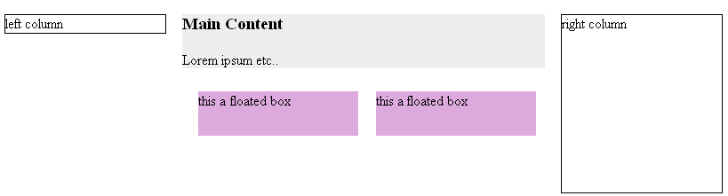
일반적으로 이것은 당신이 (주요 내용)에 아무런 배경 색상이나 내부가 없다 특히, 괜찮 수레 - 통지 수레 잘 (아직 삭제되지 않음) 그들이 무슨 당신이 그들을 제외하고 아마 다하고 있습니다 하지만 그들은는 H3의 최고 여백과 p의 아래쪽 여백은 실제로 콘텐츠 div (밝은 회색 배경)에 포함되지 않습니다.
따라서 위 코드의 동일한 간단한 여백 시나리오에 다음을 추가하십시오.
.clear-r {clear: right;}
CSS에 추가하고 두 번째 HTML 플로팅 상자를 다음과 같이 변경합니다.
<div class="floated clear-r"> this a floated cleared box</div>
#left-col {
  border: 1px solid #000;
  width: 180px;
  float: left;
}
#right-col {
  border: 1px solid #000;
  width: 180px;
  float: right;
  height: 200px;
}
#content {
  background: #eee;
  margin: 0 200px;
}
.floated {
  float: right;
  width: 180px;
  height: 100px;
  background: #dad;
}
.clear-r {
  clear: right;
}
<div id="left-col">left column</div>
<div id="right-col">right column</div>
<div id="content">
<h3>Main Content</h3>
<p>Lorem ipsum etc..</p>
<div class="floated">this a floated box</div>
<div class="floated clear-r">this a floated cleared box</div>
</div>이번에는 다음을 얻습니다.
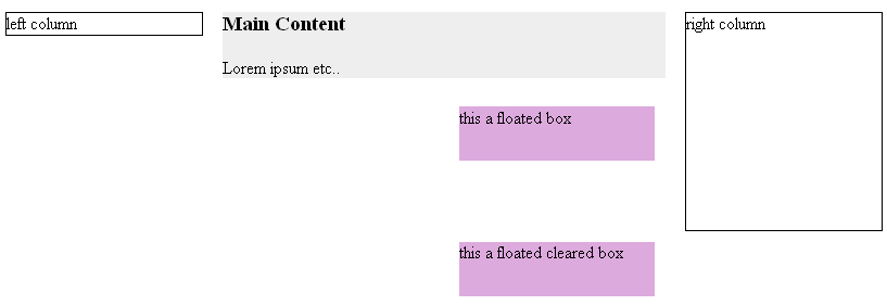
두 번째 플로트는 오른쪽을 지우지 만 오른쪽 열의 전체 높이를 지우고 있습니다. 오른쪽 열은 소스 코드의 앞부분에 플로팅되므로 말한대로 지워집니다! 하지만 원하는 효과가 아닐 수 있지만 h3및 p여백이 여전히 축소되어 있습니다 (포함되지 않음).
아이들을 위해 블록 형식화 컨텍스트를 설정하십시오!
마지막으로 메인 콘텐츠 열이 책임을지게합니다- 블록 포맷팅 컨텍스트가됩니다 -콘텐츠에 대해 : margin: 0 200px;메인 콘텐츠 CSS 및 ADD 에서 제거 overflow: hidden;하면 다음을 얻을 수 있습니다.
#left-col {
  border: 1px solid #000;
  width: 180px;
  float: left;
}
#right-col {
  border: 1px solid #000;
  width: 180px;
  float: right;
  height: 200px;
}
#content {
  background: #eee;
  overflow: hidden;
}
.floated {
  float: right;
  width: 180px;
  height: 100px;
  background: #dad;
}
.clear-r {
  clear: right;
}
<div id="left-col">left column</div>
<div id="right-col">right column</div>
<div id="content">
<h3>Main Content</h3>
<p>Lorem ipsum etc..</p>
<div class="floated">this a floated box</div>
<div class="floated clear-r">this a floated cleared box</div>
</div>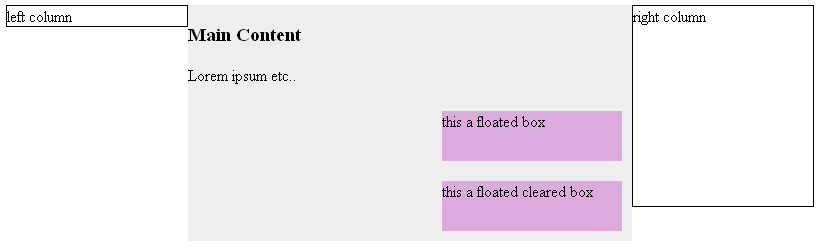
This is probably much more like what you would expect to happen, note now the floats are contained, they clear properly ignoring the right side column, and also the h3 and p margins are contained instead of collapsed.
With the extensive use of resets these days the margins are less noticeable (and IE still doesn't get them quite right) however what just happened to the centre "main content" is that it became a Block Formatting Context and is now responsible for its own child (descendant) elements. It's actually very similar to Microsoft's early days notion of hasLayout, it uses the same properties display: inline-block, float, and overflow anything other than visible, and of course table cells always have layout.. it is however without the bugs ;)
Hope that helps a bit, any questions feel free to ask!
Update: re more information in question:
When you say "but floating elements are ignored when user agent draws box and take them into account when they fill out content."
Yes floats normally overlay their container boxes, is that what you mean about parent boundaries? When a block element is drawn and it contains a float the block parent itself is drawn as a rectangle under the float and it is the "inline anonymous boxes" or simply "line boxes" of the other child elements that are shortened to make room for the float
Take this code:
#content {
  background: #eee;
  color #000;
  border: 3px solid #444;
}
.float {
  background: rgba(0, 0, 255, 0.5);
  border: 1px solid #00f;
  width: 150px;
  height: 150px;
  float: left;
  margin: 10px;
}
p {
  background: #444;
  color: #fff;
}
<div id="content">
<div class="float">floated box</div>
<h3>This is a content box</h3>
<p>it contains a left floated box, you can see the actual content div does go under the float, but that it is the <h3> and <p> <b>line boxes</b> that are shortened to make room for the float, this is normal behaviour</p>
</div>Which produces this:
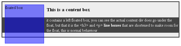
You see that the parent element doesn't actually contain the float, as in it doesn't wrap it entirely.. the float is simply floating on top of the content - if you were to keep adding content to the div it would eventually wrap underneath the float because there would be no need for the (anonymous) "line boxes" of the p element to shorten themselves any more.
I've coloured the paragraph element so you can see that it too actually goes under the float, the darkgray background is where the paragraph starts, the white text is where the "anonymous line box" starts - it's only actually them that "make room" for the float, unless you tell it otherwise (i.e. you change the context)
위의 그림을 다시 참조하면 p요소 의 왼쪽에 여백을두면 "라인 상자"(흰색 텍스트)가 왼쪽 가장자리에만 닿기 때문에 플로트 하단 아래의 텍스트 줄 바꿈이 중지됩니다. 컨테이너의 색상이 지정된 배경을 p오른쪽으로 가져와 플로트에서 제거하지만 p의 서식 컨텍스트 의 동작을 변경하지는 않습니다 . 위의 첫 번째 그림의 중앙 열처럼;)
참고 URL : https://stackoverflow.com/questions/6196725/how-does-the-css-block-formatting-context-work
'Development Tip' 카테고리의 다른 글
| PHP에서 NULL과 null의 차이점 (0) | 2020.10.14 |
|---|---|
| ERB에서 ERB 태그를 어떻게 이스케이프합니까? (0) | 2020.10.14 |
| Git의 화이트리스트 및 하위 디렉터리 (0) | 2020.10.14 |
| IntelliJ IDEA 12에서 저장시 후행 공백 제거 (0) | 2020.10.14 |
| 이름이 PDB 명령과 충돌하는 변수를 어떻게 조작합니까? (0) | 2020.10.14 |